Props to all you themers out there, but I think one of the most annoying things, that is for whatever reason overlooked when people are theming or porting over themes is the progress bar/download bar xml file. Id prefer that if I had a blue theme for instance, that when I was changing the volume, or looking at something with a status bar, that its not red, like the usual UD is. Completely throws off the entire look of some themes.
Sent from my Droid using DroidForums App
Yeah I hear ya, I always hated that as well... but reality is that many of the themes are only with the images/icons modded or colorized. But there are themes out there where the compiler does edit the XMLs to attain that progress bar color change, amongst other color changes..

If you create a theme I really think you should make the whole thing work together as a whole. I try to do this in my
Luna Theme. Personally there is no excuse for the progress bars to not fit. Its easy as pie to change. I change a few things here and there for my Luna Theme update, and even if I use the theme porter all I have to do is then drag in the
progress_horizontal.xml file and a few JPGs that don't get moved for wallpapers and such.
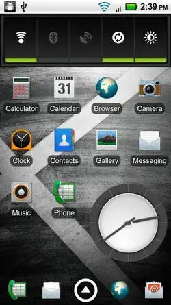
Also, I noticed some people didn't bother to edit the new graphics in the notification control widget. They are all located in the framework and are simple enough to change. I got rid of the bar under them and made them dark grey when OFF and light blue when ON... looks good!

